
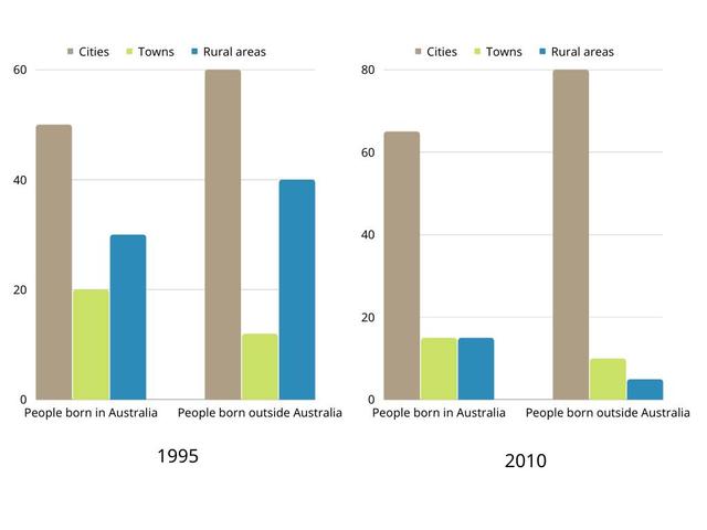
The bar chart illustrates data in percentages of people who were born in Australia and others who were born outside the country and living in cities, towns and country areas. The scheme is broken into 2 parts exhibiting a comparison between 1995 and 2010 years.
Overall
, individuals living in Cities are marked in brown colour, living in towns is represented in light green and living in rural areas is shown in sea blue colour. Linking Words
In addition
, research starts with people born in Australia and living in cities. Linking Words
Moreover
, the percentage of them changed from approximately forty-five to more than sixty per cent. It means that the level of the highly increased at least by one-third.
In conclusion, the number of Individuals living in the towns was cut by more than five per cent from the level of twenty per cent. The summary of people living in rural areas who were born in Australia dropped more than three times over fifteen years.Linking Words