
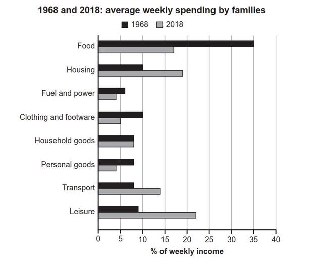
The bar chart illustrates how the weekly household budget was allocated in a specific nation in the years 1968 and 2018.
Overall
, it is apparent that the money spent on food each week accounted for the largest proportion of a family’s weekly income in 1968, Linking Words
whereas
the equivalent figure for leisure spending grew to be the highest in 2018.
Between 1968 and 2018, a plunge could clearly be seen in the amount of money distributed to food, with the figure shrinking by half to 17.5% in the end. Linking Words
Similarly
, the expenditure on clothes and shoes and that on personal commodities Linking Words
also
decreased by half over Linking Words
this
period, ending at 5% and 4% respectively.
Linking Words
By contrast
, the spending on housing and that on transportation every week saw an increment throughout Linking Words
this
period, with the former rising to around 20% and the latter reaching close to 15% in 2018. More striking is that the weekly spending on leisure grew remarkably, more than doubling to around 22%.
Interestingly, there was no change in the weekly expenditure on household goods with the figure stagnant at roughly 8% in both yearsLinking Words