
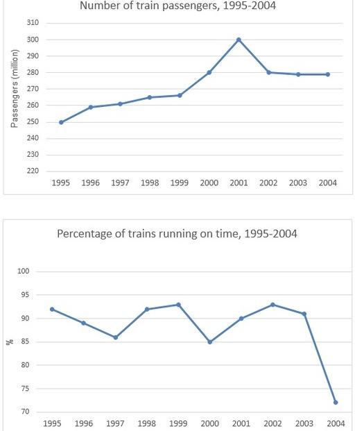
the graph compares the
number
of Use synonyms
train
Use synonyms
passengers
and the Use synonyms
percentage
of Use synonyms
trains
running on Use synonyms
time
from 1995 to 2004.
it is clear that in 1995 ,the amount of Use synonyms
train
Use synonyms
passengers
was the lowest meanwhile the accounted of Use synonyms
trains
running on Use synonyms
time
was the highest. the Use synonyms
number
of Use synonyms
train
Use synonyms
passengers
in 2001 was the highest, but the Use synonyms
percentage
of Use synonyms
trains
running in 2000 was the lowest .
the figure for Use synonyms
train
Use synonyms
passengers
increased gradually from 250 in 1995 Use synonyms
million
to 265 Use synonyms
million
in 1999.but the Use synonyms
percentage
of Use synonyms
trains
running on Use synonyms
time
declined significantly from 94% to 86% from 1995 to 1997 and increased to 94% from 1997 to 1999.
from 1999 to 2002, the Use synonyms
number
of Use synonyms
train
Use synonyms
passengers
increased dramatically to 300 Use synonyms
million
,but the Use synonyms
percentage
of Use synonyms
trains
running on Use synonyms
time
declined rapidly to 85%.from 2001 to 2004 the Use synonyms
number
of Use synonyms
passengers
falling to 280 Use synonyms
million
in 2002,and Use synonyms
then
keep steadily in the Linking Words
last
3 years, Linking Words
by contrast
,the accounted for Linking Words
trains
running on Use synonyms
time
showed a downward trend to 74 %.Use synonyms