
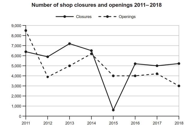
The graph illustrates two different figures on the shop in one country between 2011 and 2018: the
openings
and the closures. Use synonyms
Overall
, Linking Words
it is clear that
there were more shops which opened than which close at the starting time, Linking Words
in contrast
in 2018 Linking Words
this
trend was inverted.
Linking Words
To begin
, in the period between 2012 and 2014, the data of closures remain higher than Linking Words
openings
, Use synonyms
although
it was Linking Words
initially
at approximately 6200, far lower than Linking Words
openings
at the same time. Use synonyms
While
the figure for Linking Words
openings
fell dramatically to 6000, starting from its highest point over the entire time frame ( at about 8500).
Use synonyms
On the other hand
, from 2015 to 2018 Linking Words
openings
had fairly a downward trend dropping by approximately 3 thousand. Meanwhile, the number of closures described a different pattern,
after the most significant decrease of Use synonyms
this
in 2015 at just over 0.5 thousand, it rose by around 4.5overtaking the Linking Words
openings
over Use synonyms
this
Linking Words
last
period.Linking Words