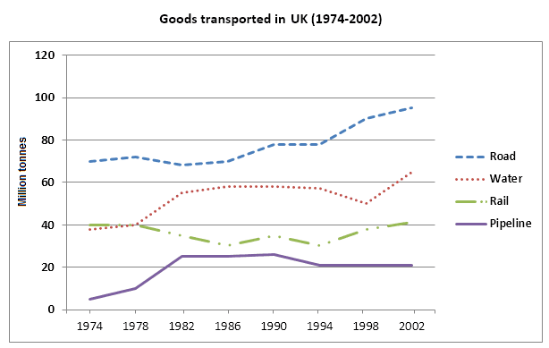
The line chart illustrates the weight of certain objects travelling
the
Change preposition
in the
show examples
United Kingdom from 1974 to 2002. The graph is measured in
million
Correct your spelling
millions
show examples
of tonnes.
Overall
Linking Words
,
diego.merino.dc
Unauthorized use and/or duplication of this material without express and written permission from this site's author and/or owner is strictly prohibited. Excerpts and links may be used, provided that full and clear credit is given to Writing9 with appropriate and specific direction to the original content.
Sentences: Add more complex sentences.
▼
Linking words: Add more linking words.
▼
Basic structure: Write more paragraphs.
▼
Basic structure: Add more body paragraphs.
▼
Common mistake: Your writing should be 150-250 words.
Basic structure: Write more paragraphs.
▼
Vocabulary: Only 3 basic words for charts were used.
▼
Vocabulary: Use several vocabularies to present the data in the second paragraph.
I hope you are doing well. I am writing this letter to you to share my amazing experience of a recent trip to Goa as I know that you are going on a vacation over there as well, next month.
Although there has been much progress in science and technology in recent years, humans still appreciate masterpieces. The writer advocates that the art can convey individuals cultural values along with ideology that cannot be showcased via technology.
The internet has indeed made our lives easy by storing all kinds of important information and useful documents are just one click away, but it has also created difficulties that never existed ever before.
Nowadays, the spread of new ways of communication using technology changed the relationships between people, it is discussed whether in a better way or not. Surely modern mobile phones have shortened the physical distance between people, but also have moved the focus on the online world instead of the real one. This essay will explore both the advantages and disadvantages of this question.
Opinions differ over whether the products should be made cheap or durable, considering the commercial value of the products. Although high-quality manufacturers can enhance the value of the brand, I suggest that economic items are more crucial than long-lasting ones for some reasons.