
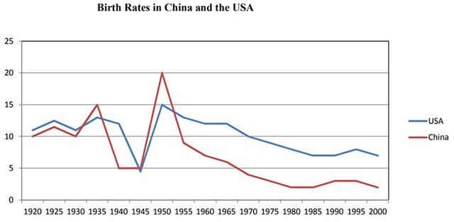
The given graph illustrates the comparison between the number of people born in
China
and the Use synonyms
USA
from 1920 to 2000.
Use synonyms
Overall
, it is clear from the graph that birth rates in both countries look almost the same in the initial Linking Words
years
but as the Use synonyms
years
passed on, the rate increased rapidly and the communist nation touched the highest point when compared to the Use synonyms
USA
. Later on , the number of newborns amount was reduced drastically in both countries. Use synonyms
However
, the Linking Words
USA
birth estimate was high compared to Use synonyms
China
.
In the initial era, the number of newborns in the Use synonyms
USA
was just above 10% with respect to Use synonyms
China
but after the year 1940 birth rates dropped steeply from 12% to 5%. Use synonyms
However
, there was a sharp rise in born percentage up to 15% . Linking Words
After
Linking Words
this
, it never touched that rate and it went down slowly in the next 50 Linking Words
years
reaching nearly just above 5% Use synonyms
although
it maintained a high throughout the Linking Words
years
rather than Use synonyms
China
.Use synonyms