
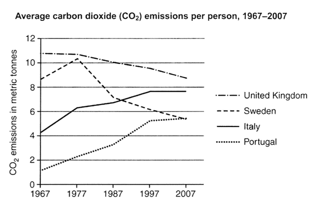
The line graph below compares the amount of average
carbon
Use synonyms
dioxide
emissions caused by every person from four different countries over the forty-year period.
Use synonyms
overall
, the total trend of Linking Words
carbon
Use synonyms
dioxide
emissions released by Portugal and Italy was upward, Use synonyms
while
the trend of numbers of the other countries was downward. despite the steady reduction, the UK contributed by far the most Linking Words
carbon
Use synonyms
dioxide
over the period shown.
Use synonyms
it is clear that
in 1967, the number of the four nations varies very much ranging from a low of 1 metric ton in Portugal to a high of about 11 metric tonnes in the UK, with Sweden (approximately 9) and Italy(slightly more than 4) in between. Between 1967 and 2007, there was a gradual drop in the UK to about 9 metric tonnes Linking Words
finally
. Linking Words
Additionally
, despite a rise to more than 11 in 1977, Linking Words
carbon
Use synonyms
dioxide
produced by people in Sweden declined steadily to less than 6.
Use synonyms
By contrast
, Italy and Portugal have a completely reversed pattern. these two countries both saw constant growth throughout the four decades. Linking Words
consequently
, Portugal reached the same level as Sweden, Linking Words
while
Italy soared up to very close to 8 metric tonnes.Linking Words