
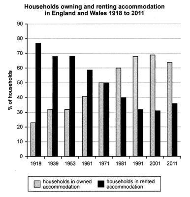
The bar diagram provides data about the differences between the shares of households that owned and rented housing in England and Wales during a period of time from 1918 to 2011.
Overall
, it is evident from the chart that the popularity of the option to rent experienced a downward trend, Linking Words
while
the opposite was true for the purchase of accommodation.
Linking Words
According to
the graph, the prevalent percentage of people decided to rent in 1918, in fact, the proportion was equal to 78%, Linking Words
additionally
, Linking Words
this
choice is observed to have its peak in Linking Words
this
year. Linking Words
However
, the spread of decisions to purchase started to increase steadily reaching the top in 1991-2001, when the share fluctuated around 70% and the proportion of households rented accommodation was equal to approximately 30%, respectively. Linking Words
Nevertheless
, even though there was a slight drop in 2011 in the demand for houses to buy, Linking Words
this
solution continued to be the superior one with an enormous gap, which constituted 30%.Linking Words