
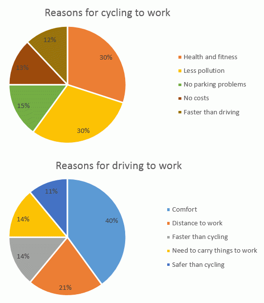
The first pie
chart
highlights information on why workers are inclined to go to work by riding a bicycle and the second pie Use synonyms
chart
Use synonyms
also
gives data about the reasons why employees leave for duty by way of driving their vehicles.
Linking Words
Overall
, it can be seen that health benefits are the head reason for cycling Linking Words
while
comfort is the cause of car drivers. Another striking point is that both gangs have nearly the same rates related to the fast category.
Looking at the details, in the cycling Linking Words
chart
, both health and fitness Use synonyms
along with
less pollution have the same rates with 30% and Linking Words
this
amount is halved in the category of no parking problems and Linking Words
following
Linking Words
this
, no casts and faster than driving ports are 13% and 12% in turn.
As regards the second pie Linking Words
chart
, the percentage of comfort is 40% and Use synonyms
this
amount is approximately halved in distance to work item and Linking Words
then
, being faster than cycling and needing to carry objects both have 14% and Linking Words
finally
, the percentage of safety is the least item with 11%.Linking Words