
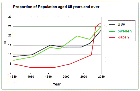
The pic depicts the percentage of people aged 65 and older in three different countries from 1940 to 2040 .
Overall
, Japan, Sweden and the USA had a constant proportion of the community aged 65 and over between 1940 and 2025. Linking Words
However
, from 2025 to 2040, all three countries are expected to increase more strongly in Linking Words
this
indicator.
On the one hand, we can see a little augmentation that has practically remained stable since 1940. There is a similar boost for the United States of America and Sweden. In more detail, the rate of over-65s in the USA and Sweden rose approximately from 7 to 17%. Linking Words
Nevertheless
, Japan had a pretty different growth. Between 1940 and 1990, it decreased slightly from 5 to 3% , and after that, it started increasing from 3 to 10%
Linking Words
On the other hand
, from 2025, the predictions said that the portion of older people in our population will shoot up more rapidly, mostly in Japan. Linking Words
This
country is expected to reach 27% in 2040. Linking Words
Furthermore
, the volume in the USA and the Northen country will Linking Words
also
rise faster than before, going from 17 to practically 25% of the population.Linking Words