
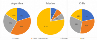
The given pie chart illustrates the percentage of the areas of merchandise that was shipped from 3 different countries in 2010. In brief, the highest proportion of the
Mexico
chart was occupied by the US, Use synonyms
whereas
other Latin America accounted for the largest section of the graphs of Argentina and Chile.
Moving to the details, Linking Words
Mexico
exported 62% of their goods to the US, and the rest categories were the same percentage which is 6%. USA was more than 3 times the sum of the EU, other Latin America and the others.
Use synonyms
On the other hand
, the pie chart of Argentina and Linking Words
Mexico
showed a similar trend, within both graphs other Latin America was in the highest position at 38% and 31 per cent respectively. Use synonyms
In addition
, Europe took up 2 highest percentage of both chats at just more than a quarter and less than a third. The Linking Words
last
position was the US at 16% in Argentina and 18% in Linking Words
Mexico
.Use synonyms