
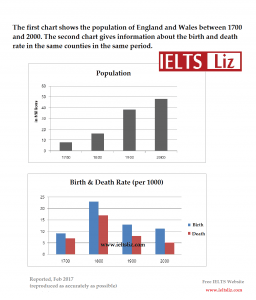
The bar charts illustrate the populace and the
birth
and Use synonyms
death
proportion in two different countries from 1700 to 2000.
Use synonyms
Overall
, what stands out from the chart is that the population experienced an upward trend over the period. Another striking factor is the Linking Words
birth
Use synonyms
rate
higher than the Use synonyms
death
during the survey period.
In 1700, the population in the two countries was about 8 Use synonyms
million
and Use synonyms
then
it saw a significant increase until it reached a peak of 48 Linking Words
million
in 2000. Use synonyms
Moreover
, in 1900, it saw the most dramatic rise over the period when it increased from 16 Linking Words
million
to 38 Use synonyms
million
.
One prominent of Use synonyms
this
data is that the Linking Words
rate
of both Use synonyms
birth
and Use synonyms
death
increased significantly from 1700 to 1800 (8 Use synonyms
thousandths
against 7 Use synonyms
thousandths
in 1700 and 23 Use synonyms
thousandths
against 17 Use synonyms
thousandths
in 1800). After an increase, there was a decline until 2000 with the figure 5 Use synonyms
thousandths
for the Use synonyms
death
Use synonyms
rate
and 12 Use synonyms
thousandths
for the Use synonyms
birth
Use synonyms
rate
).Use synonyms