
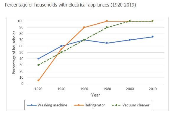
There are two-line chart diagrams depicting changes that the
percentage
of electrical appliances in households in 1920-2019 and the total Use synonyms
time
of doing Use synonyms
housework
every week at the same Use synonyms
time
.
For the first line chart diagram, Use synonyms
it is clear that
the figures are about three kinds of electrical equipment. For the Linking Words
percentage
of washing machines, it could be noticed that there existed a slightly increased from 1920 to 1960. Use synonyms
Furthermore
, it increased by 30%. From 1960 to the next 50 years, it kept steady. The Linking Words
percentage
of households with refrigerators and vacuum cleaners, as an Use synonyms
overall
Linking Words
trend
, climbed from 1920 to 2019. It should be noticed that the Use synonyms
percentage
of refrigerators had a more dramatic change than the vacuum cleaners. It clearly shows that the rate of using refrigerators had rapidly increased, and nearly 100 per cent went up.
The second line chart diagram represents the Use synonyms
time
Use synonyms
people
do Use synonyms
housework
every week. It shows a quickly decreased Use synonyms
trend
. In 1950, Use synonyms
people
did Use synonyms
housework
at least to spend 50 hours, and yet Use synonyms
people
only spent ten hours on Use synonyms
housework
in 2019. It was a dramatic change.
In conclusion, it is obvious that the Use synonyms
percentage
of households with electrical equipment is increasing Use synonyms
trend
. Use synonyms
In addition
, Linking Words
people
spending Use synonyms
time
on homework had a going up Use synonyms
trend
.Use synonyms