
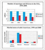
The bar charts illustrate the statistics of US citizens about marriage and divorce from 1970 to 2000 and the wedding situations between 1970 and 2000.
Overall
, it can be clearly seen that there is a downward trend in Marriages, Linking Words
while
there is a fluctuating tendency in Divorces over four years. Linking Words
Besides
, the percentage of married people shows a maximum figure over two years.
Linking Words
According to
the first graph, Marriage figures in 1970 and 1980 displayed the same number of 2.5 Linking Words
million
, which was the highest in the given period. After that, there was a slight drop in 1990 presented at approximately 2.3 Use synonyms
million
. Use synonyms
However
, there was the lowest point in 2000 exhibited at 2 Linking Words
million
. Use synonyms
Likewise
, Divorces in 1970 represented 1 Linking Words
million
, which was the same number as in 2000, Use synonyms
while
the highest number of Divorces was in 1980 shown as about 1.4 Linking Words
million
, followed by those in 1990 depicted as roughly 1.2 Use synonyms
million
respectively.
As seen in the second graph, the Married figure was the highest trend in both years, 70% in 1970 and 60% in 2000 orderly. Use synonyms
Whereas
, Divorced represented the lowest percentage, almost 2% in 1970 and 4% in 2000 Linking Words
consequently
.Linking Words