
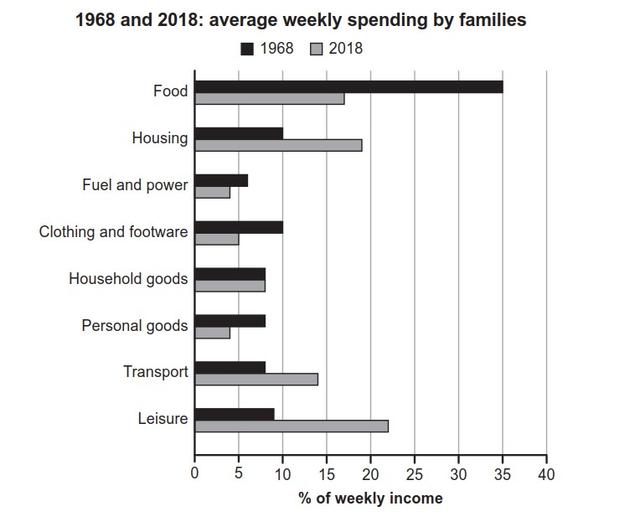
The bar chart below depicts, over 50 years, the several activities that families spent during their week.
From an
overall
perspective, the statistics start from the year 1968 to end up with the period time of 2018. Linking Words
Additionally
, as has been already mentioned, the activities taken into consideration are many, or rather 8, namely Food, Housing, Fuel and Power, Clothing and footwear, Household goods, Personal goods, Transports and Leisure.
Linking Words
To begin
with, the first case is related to food, which reaches a percentage of 35% in the year 1968 and 18% over the years. Following the activity of housing, the fractions are both under 20%, or rather 10% and 19%. The equal situation is for Fuel and Power, Clothing, Household and Personal, which fees are lower than 10%. Linking Words
While
the transport case illustrates, for the first year, the result of 8%, Linking Words
whereas
14% for 2018. In the Linking Words
last
case, which is Leisure, its proportions are one less than 10%(9%) and the other up 20% (22%).
Linking Words
To sum up
, with what has already been analysed, it's relevant to highlight that over the years a variety of activities, have been taken different processes.Linking Words