
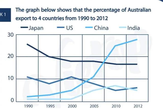
The chart below depicts, over 22
years
in 4 wide countries of the world, the fraction of Australian export in billions of dollars.
From an Use synonyms
overall
perspective, as has already been mentioned, the countries taken into consideration are 4, namely Japan, the US, China and India. Linking Words
Additionally
,information is the process illustrated, which starts from Linking Words
Use synonyms
years
1990 to end up with the period time of 2012.
Correct article usage
the years
To begin
with the first year ( 1990), it's evident that its highest fraction of 25% is for the country of Japan, Linking Words
while
the lowest of 1% is for India's case. Linking Words
On the other hand
, China has 1% more than India and US is slightly over 10%. The situation, still with the same classification until Linking Words
years
2000, when the position of the countries starts to change. Use synonyms
Therefore
, China rise its fee, reaching the top over the 12 Linking Words
years
, Use synonyms
whereas
the US will absolutely drop its process; Becoming the Linking Words
last
one. Japan, Linking Words
instead
, will deal with a decline under 19%, rather than the first position.
Linking Words
To sum up
, with what has been already analysed and compared, it's crucial to highlight that, over the Linking Words
years
many circumstances could change, moving from the first to the Use synonyms
last
.Linking Words