
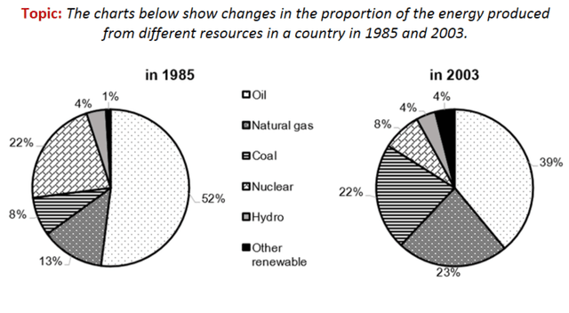
The given pie charts provide statistical data about the percentage of
energy
production from various derivations in an unspecified nation in 1985 and 2003.
Use synonyms
Overall
, at the beginning of the period, the other renewable segment contributed the least to Linking Words
energy
production, whilst oil was the most significant sector. In comparison, Use synonyms
at the end
of the period, oil still dominated the biggest contribution to the Linking Words
energy
manufacturing of a country Use synonyms
while
some of the other segments witnessed an increase.
In 1985, oil accounted for over half of the Linking Words
energy
in an unknown country, 52% before plummeting to only 39%. The power production from the nuclear sector was at 22% and had a dramatic decline of 5%. Meanwhile, the contribution from hydrogen remained constant at 4%.
At the beginning of the period, the other renewable and natural gas sources made up 1% and 13%, respectively and both witnessed an escalation of up to 4% from other renewables and nearly a quarter from natural gas. Coal comprised only 8% and it Use synonyms
subsequently
experienced almost a twofold rise in 2003, 13%Linking Words