
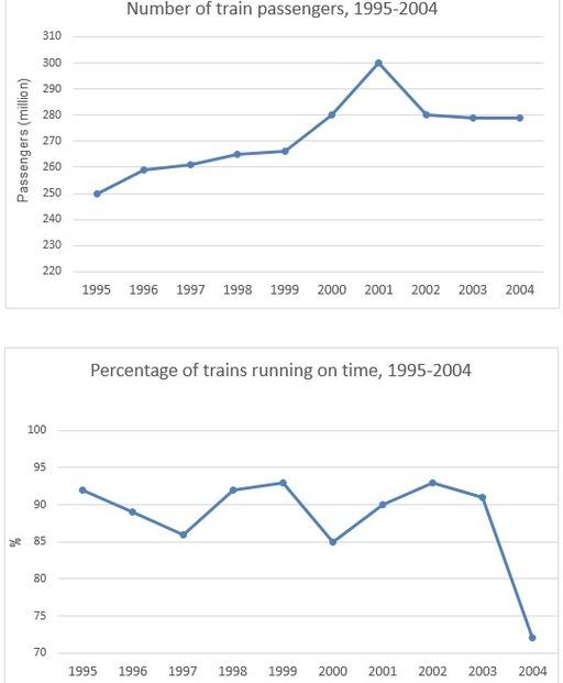
The graphs illustrate how many travellers commuted by rail in Sydney and the proportion of trains departed punctually during the period from 1995 to 2004.
it is clear that
there was an upward tendency in the number of commuters travelling by train throughout the years, Linking Words
while
the opposite was true for the percentage of trains running on time.
as can be seen, about 250 Linking Words
million
passengers took the tracks in 1995. Over the next four years, the figure for that increased to nearly 270 Use synonyms
million
and reached a peak of 300 Use synonyms
million
in 2001. Use synonyms
however
, the sum of people using the railway decreased considerably to 280 Linking Words
million
in 2002 and remained stable until 2004.
regarding the second graph, in 1995, approximately 92% of trains started on time. Within 5 years, the fluctuation was experienced, but the total of punctual departures climbed again and returned to its initial point in 2002. Despite that, the service got worse as it dropped sharply to a low of only 72% of journeys being on schedule.Use synonyms