
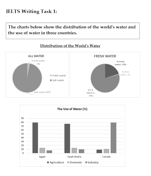
Overall
, the pie chart represents the percentage of Linking Words
water
supply around the world. Use synonyms
Similarly
, the bar graph gives information regarding the utilization of those distributed fluids in three different nations (Egypt, Saudi Arabia and Canada).
At first glance, it can be clearly observed that the company 'All Linking Words
Water
' supplies fresh Use synonyms
water
and salt Use synonyms
water
. Again, 'Fresh Use synonyms
Water
' deliver groundwater, surface Use synonyms
water
and ice and glaciers globally. Use synonyms
Further
, the Egyptians and the Arabians adopt those liquids in the same manner. Linking Words
However
, there is exactly the opposite trend in Canada.
Linking Words
Moreover
, 'All Linking Words
Water
' supplies a maximum percentage of salt Use synonyms
water
and less than five per cent of fresh Use synonyms
water
. Use synonyms
Also
, 'Fresh Linking Words
Water
' delivers less than four-fifth of ice and glaciers, less than a fifth of groundwater and one per cent of surface Use synonyms
water
. Use synonyms
Further
, Egypt and Saudi Arabia utilize around a fifth of the liquid for agriculture, more than ten per cent in industrial areas. Linking Words
Nevertheless
, Canadians use a fifth of those fluids in industries, one in ten for domestic reasons and less than one in ten for farms.Linking Words