
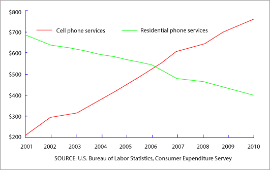
The line graph depicts the average years of spending by US consumers on cell services and residential mobile services from 2001 to 2010.
Overall
, spending money on cell services has increased a lot over Linking Words
this
time. And spending on residential Linking Words
phone
has decreased significantly. Check wording
phones
In addition
, the lines met in 2006, when people started spending more money on cell phones than on residential phones.
Linking Words
Firstly
, in 2001, we can see that people spend like 200 dollars per year on a cellphone service. Linking Words
However
, that increased a lot over time. Linking Words
For example
, it was 300$ in 2002 and grew to $500 in 2006. After that, spending increased more, raising $750 in 2010.
Linking Words
On the other hand
, spending money on residential telephone Linking Words
starts
to be the opposite. At the beginning of that, people spent like $700 in 2001. Check wording
service starts
However
, Linking Words
this
price gradually decreased over the years . Linking Words
For instance
, it went to 600$ in 2004 and Linking Words
then
to $500 in 2006. Linking Words
Finally
, in 2010, Linking Words
that
decreased a lot to $400.Correct pronoun usage
it