
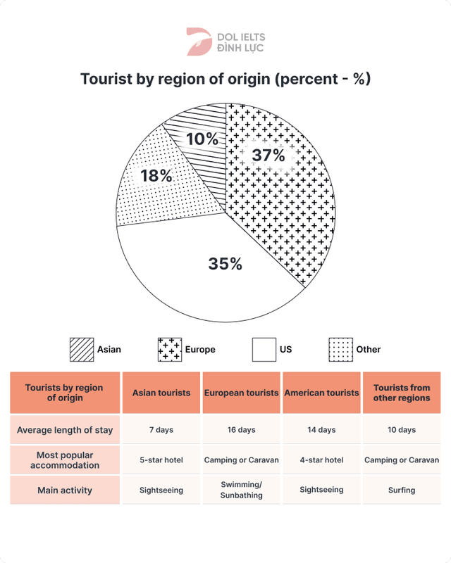
The pie chart illustrates the origin of tourists who visit Australia for their holiday.
While
the table data show us the estimated length of stay , the most used accommodation and the main activity of those said holidaymakers. Linking Words
According to
the given data, there are 4 distinct groups of tourists Linking Words
according to
their origin continent.
The pie chart is divided into 4 sections for each tourist's origin continent which is Asia, Europe, the US, and others. Around a little bit over one-third of total visitors came from Asia, Linking Words
This
makes them the biggest portion of visitors who come to Australia. Coming in second with a slightly lower percentage is the European visitor, Who Linking Words
also
make up another one-third of the total tourist's number. and the Linking Words
last
one-third is the combination of American tourists and those from other regions, with Americans taking up a bigger half of the 2 combined numbers.
Linking Words
According to
the data in the table given to us,it can be seen that the average length of stay is around half a month with Asian travellers spending the least time. And for the Accommodation, each group has their own preference. Linking Words
Lastly
, the main attraction for each group is sightseeing for Asian and American groups and others for the rest.Linking Words