
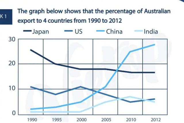
The graph above includes information on
export
percentages in 4 Use synonyms
countries
since 1990. These indicators explain how the situation changed in different Use synonyms
countries
. As it is seen some governments try to develop their Use synonyms
export
potential Use synonyms
while
others are sending fewer.
From the graph, Linking Words
it is clear that
the highest changes in Linking Words
export
are in Use synonyms
China
when in other Use synonyms
countries
it is going down. And it seems that Use synonyms
China
's economy dramatically rose for a long time.
Use synonyms
However
, in the 2010s Linking Words
export
rate is getting more stable in 3 Use synonyms
countries
and even in Use synonyms
China
the indicator is growing more slowly than in older periods.
Use synonyms
On the other hand
, we can see that the Linking Words
export
rate in all Use synonyms
countries
, except Use synonyms
China
fluctuated during the whole period and in the Use synonyms
last
years Indian Linking Words
export
is gradually decreasing.
In conclusion, we can say that the world economy is stable and slightly increased in a huge timeline.Use synonyms