
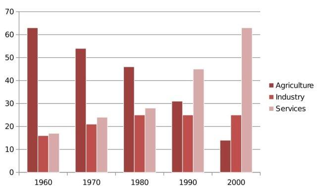
The bar graph illustrates the information about the
Agriculture
, Use synonyms
Industry
and services sector contribution to India's GDP between 1960 to 2000. Use synonyms
Overall
, It is noticeable that by the end of the Linking Words
,
period services have invested a lot in India GDP's compared to Remove the comma
apply
agriculture
and Use synonyms
industry
. In ,contrast Use synonyms
Agriculture
was seeing a drastic drop by 2000.
In regard to Use synonyms
agriculture
, 40 years ago they started with a 63% contribution and being the maximum contributor to India's GDP compared to the other sectors, but slowly it followed a reversal trend where the percentage is 15% by 2000. Use synonyms
Whereas
the Linking Words
Industry
sector was gradually growing with a 5% difference from 1960 to 1980 and it became stable for the next years and ended at 25% by 2020.
Use synonyms
On the other hand
, year by year the growth of the service Linking Words
industry
in the contribution is increasing and It shows the opposite view of Use synonyms
agriculture
and achieved the proportion that Use synonyms
agriculture
was providing in 1960 as 60%Use synonyms