The bar chart below gives information about the percentage of the population living in urban areas in different parts of the world

The bar chart below gives information about the percentage of the population living in urban areas in different parts of the world
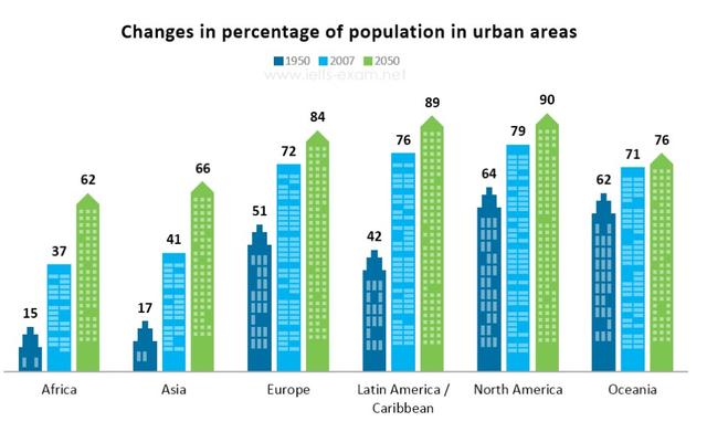
The chart informs about the percentage of human residence in city areas on different continents in the years 1950, 2007, and 2050.
Overall
, it can be seen that from 1950 to 2050, people tend to change their living placement in urban areas.
First,
2050 witnessed a great change in residents in North America and Latin America/Caribbean which turn out about 90% and 89% respectively of their living people changed to the city areas.
On the other hand
, Africa only goes by 62% in the year 2050.
However
,
this
population has the most increased growth rate since 1950 which goes up by four times. Asia has a similar growth rate that occurs to Africa between 1950 and 2050 just increased almost 4 times.
Submitted by galihw on

Unauthorized use and/or duplication of this material without express and written permission from this site’s author and/or owner is strictly prohibited. Excerpts and links may be used, provided that full and clear credit is given to Writing9 with appropriate and specific direction to the original content.

Introduction: The introduction is missing.
Introduction: Change the first sentence in the introduction.
Introduction: The chart intro is missing.
Common mistake: Your writing should be 150-250 words.
Introduction: The chart intro is missing.
Vocabulary: The word "change" was used 3 times.
Vocabulary: The word "growth" was used 2 times.
Vocabulary: The word "increased" was used 2 times.
Vocabulary: The word "about" was used 2 times.
What to do next:
Look at other essays: