
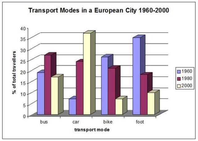
The bar chart demonstrates the
percentage
of four transportation used to travel or to work in a specific city in Europe during 40 year-period from 1960.
Use synonyms
Overall
, Linking Words
it is clear that
all four different means of transport fluctuated significantly over the given period. The Linking Words
proportion
of the three transport modes showed a decreasing pattern, except for the car.
Looking at the chart more closely, one can see that the rate of total travellers by bus peaked at about 26 Use synonyms
per
Change preposition
apply
cent
in 1980, before dropping to approximately 16%, which was similar to its Use synonyms
proportion
in 1960. The Use synonyms
proportion
of usage of cars soared dramatically from roughly 6 per Use synonyms
cent
in 1960 to more than 35 per Use synonyms
cent
in 2000, becoming the most popular transportation system in the final year of the period. Use synonyms
In contrast
, the Linking Words
proportion
of travel by foot plummeted considerably by more than 20 per Use synonyms
cent
during the whole period. Meanwhile, for the Use synonyms
percentage
of total travellers by bike, it fell notably by 5% in the first 20 years and became one-third of its Use synonyms
percentage
in the initial year, which was the least Use synonyms
percentage
in 2000 at about 6 per Use synonyms
cent
.Use synonyms