
These provided pie charts illustrate the changes in the annual expenses of a specific school in the UK in three different years, in 1981, 1991, and 2001.
Overall
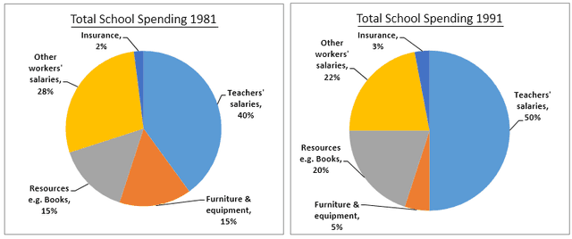
, it can be seen that the total school expenditures were mainly composed of five items, and there was a change in the spending for each item across the given three years.
Linking Words
To begin
, in 1981, teachers’ salaries took the highest percentage of spending, at 40%, and even though they increased to 50%, in 1991, they experienced a slight drop to 45%, in 2001. Linking Words
In addition
to that, the salaries of other workers accounted for the second ratio of expenses, at 28%, in 1981, Linking Words
then
; they reduced to 22%, in 1991 and to 15% in 2001.
Regarding furniture and equipment and resources Linking Words
such
as books, in 1981, the cost of expenses for each one was at the same ratio of 15%, but there was a fluctuation for both of them in 1991, the ratio of spending on resources elevated to 20%, Linking Words
then
; it reduced to 9%, in 2001, Linking Words
whereas
in 1991 the percentage of expenditures on furniture and equipment dropped to 5%, and Linking Words
then
increased, in 2001.Linking Words