
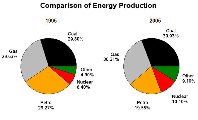
The pie charts detail the distribution of various
energy
sources in a given nation in the years 1995 and 2005. Looking from an Use synonyms
overall
perspective, it is readily apparent that Linking Words
production
of two main energies (coal and gas) rose marginally, Use synonyms
while
petrol declined considerably. ‘Other’ and nuclear Linking Words
production
Use synonyms
also
grew greatly, despite remaining less popular in both years.
In 1995, coal, gas, and petrol were roughly equal in terms of Linking Words
energy
Use synonyms
production
with each slightly above 29%. By 2005, the figures for coal and gas had risen moderately (30.93% and 30.31%, respectively) Use synonyms
while
petrol exploitation declined to represent just 19.55% of all sources.
The data for the remaining categories was considerably lower with ‘other’ accounting for 4.9% of Linking Words
energy
Use synonyms
production
Use synonyms
to begin
the period and nuclear noticeably higher at 6.4%. By 2005, ‘other’ had narrowed the disparity and nearly doubled to 9.1% as nuclear Linking Words
energy
use grew more slowly to reach 10.1%.Use synonyms