
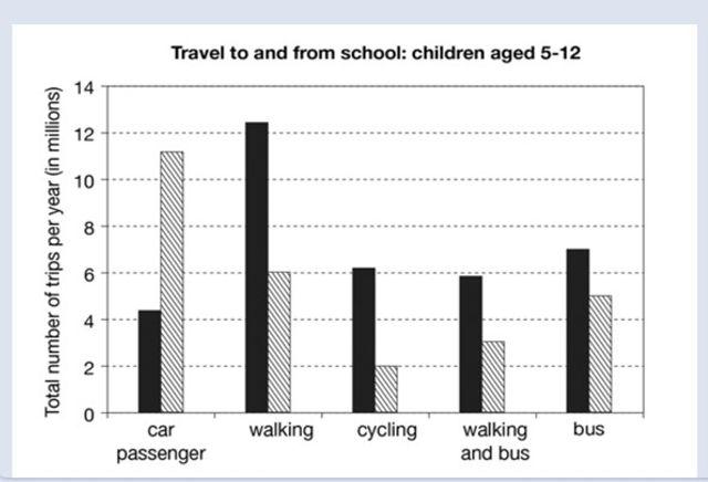
The presented chart provides information on the rate of children aged 5-12 that commute to school by various
ways of transport from 1990 to 2010.
As is observed , in 1990 not only walking but
also
buses were the most popular modes of transport
Among students ,Linking Words
however
,travelling by car ,cycling , both walking and Linking Words
bus
were the least popular. On the other ,side both cars and walking were the highest in 2010, Use synonyms
besides
that, cycling ,Linking Words
bus
, walking and Use synonyms
bus
together were the lowest in 2010.
To commence, the second way of transport was over 12 Use synonyms
million
in1990 which decreased to 6 Use synonyms
million
in 2010.
Use synonyms
In contrast
, car passengers were above 4 Linking Words
million
which surged to around 11 Use synonyms
million
students in 2010.Use synonyms
furthermore
,
Linking Words
bus
, walking and Use synonyms
bus
together were around 7 and under 6 Use synonyms
million
respectively. which declined to under 6 Use synonyms
million
followed by walking and Use synonyms
bus
which reduced to approximately 3 Use synonyms
million
people . In a similar fashion
Cycling which had the smallest portion among others was about 6 in 1990 with a reduction of 2 Use synonyms
million
in 2010.Use synonyms