
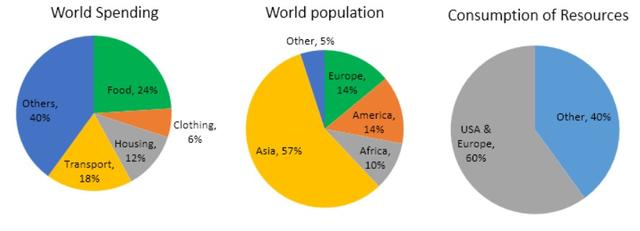
The three pie charts respectively illustrate the expenditure and resources consumed by countries around the world and the demographic distribution.
Overall
, the vast majority of global spending was on other parts except food, clothing,housing and transport. Linking Words
Although
the population of Asia stood over one-half of the world, resources were mainly consumed in the U.S.A. and Europe.
Linking Words
According to
the information shown in the graph, Americans and Europeans accounted for the same Linking Words
demographics
proportion, which was 14%, Replace the word
demographic
however
, they took 60% of the Linking Words
energies
, Fix the agreement mistake
energy
while
Asians accounted for greater percentages (57%) and shared the rest 40% consumption of energies with the Africans and people in other countries. As for the cost distribution, food expenses made up 24%, which was the highest excluding the other parts. Linking Words
By contrast
, people spend the least on clothing as it only made up 6%. What should be particularly mentioned were transportation costs comprised 18% and housing constituted 12%.
As was demonstrated in the diagram, it can be apparently seen that the global population was not in direct proportion to the resource distribution. Linking Words
Furthermore
, the global spending was primarily on others Linking Words
excepting
daily requirements.Wrong verb form
except for