
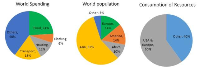
The information provided in the pie charts depicts the proportion of the usage of some basic necessities by different
nations
and how the masses of all Use synonyms
states
are scattered all over the globe.
Use synonyms
Overall
, the pie charts illustrate in what proportion different Linking Words
nations
use the basic essentials, Use synonyms
whereas
they Linking Words
also
depict in what ratio these Linking Words
states
spend on the necessities.
Use synonyms
Firstly
, more than half of the world's Linking Words
states
are in Asia, which is almost 57% of the global masses, Use synonyms
nevertheless
, 43% consists of other Linking Words
nations
, which covers all other continents. Use synonyms
Furthermore
, it is noticeable from the pie charts that Linking Words
nations
like the United Use synonyms
States
and Europe consume a large part of the natural resources, Use synonyms
in contrast
, other Linking Words
nations
use almost 40% of the basic necessities of life, which is a minuscule ratio compared to America and European Use synonyms
nations
. Considering the statistics of the world spending, the data indicates that the world spends 24% on food, 6% on clothing, and 12% are residential expenditures, Use synonyms
however
, transport and others are 18% and 40%.
Linking Words
To sum up
, the US and EU countries have the highest ratio in terms of usage, Linking Words
while
other Linking Words
nations
have the lowest, which is about 40%.Use synonyms