
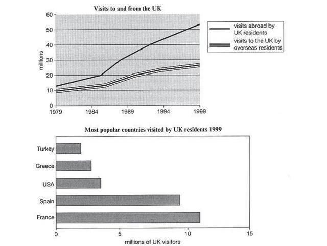
The first diagram reveals the number of visitors to and from the UK from 1979 to 1999.
Additionally
, the below bar chart illustrates information regarding the most travelled nations the residents in 1999.
Linking Words
To begin
with, the line graph demonstrates that UK citizens were going abroad more frequently, over 50 Linking Words
million
in 1999 and roughly 13 Use synonyms
million
in 1979. Generally speaking, it underwent continuous growth and soared from around 1986 at a staggering speed. Use synonyms
On the other hand
, foreign tourists Linking Words
also
gradually increased from approximately 10 Linking Words
million
in 1979, and Use synonyms
then
28 Linking Words
million
in 1999. Use synonyms
Overall
, it is evident that UK travellers to overseas countries have a more significant climb compared to the other line.
The second figure provided shows the most popular regions for the United Kingdom dwellers in 1999. Obviously, France had the highest number counted, at nearly 12 Linking Words
million
, followed by Spain at 9 Use synonyms
million
. Use synonyms
However
, the following ranking which includes the USA, Greece and Turkey, has similar figures that around 2.5 to 4.5 Linking Words
million
per year.Use synonyms