
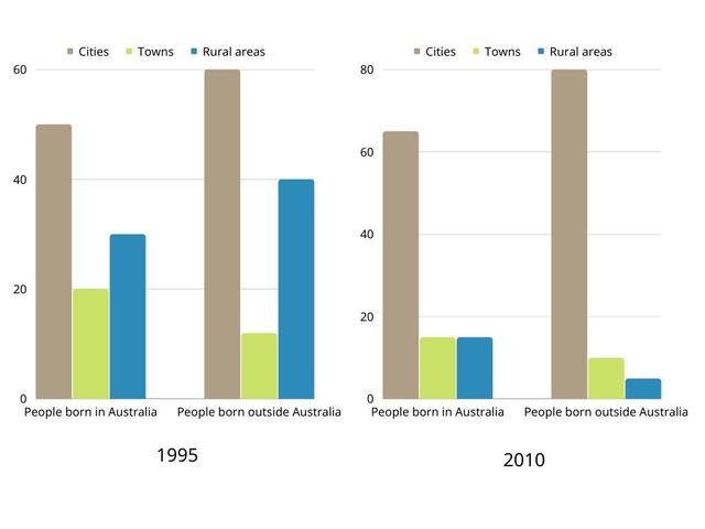
The
bar
above illustrates Use synonyms
about
Change preposition
apply
people
who were born in Use synonyms
Australia
and Use synonyms
people
who were born outside Use synonyms
Australia
living in urban,rural and Use synonyms
cities
between the time period of 1995 and 2010.
Here,we are going to compare the chart and report the main features of the Use synonyms
bar
diagram.
In 1995, Use synonyms
people
born outside Use synonyms
Australia
in Use synonyms
cities
Use synonyms
are
comparatively Wrong verb form
was
high
than the Correct word choice
higher
people
born inside Use synonyms
Australia
. But, Use synonyms
people
Use synonyms
those
who are born outside Correct pronoun usage
apply
Australia
in rural areas Use synonyms
is
higher than the Correct subject-verb agreement
are
people
born inside the capital. Outside Use synonyms
Use synonyms
Australia
those who are living in towns are in the Add a comma
,Australia
least
percentage.
During 2010, the number of Correct word choice
lowest
count
in Change to a plural noun
counts
cities
outside has been increasingly high than the Use synonyms
Use synonyms
people
living inside the capital. Correct quantifier usage
number of people
People
Use synonyms
those
who are living Correct pronoun usage
apply
inside
Change preposition
in
Australia
in towns and Use synonyms
cities
are Use synonyms
comparetively
the same.
In both the Correct your spelling
comparatively
bar
diagrams, Use synonyms
people
who are born outside Use synonyms
Australia
in towns are equally the same in percentage. They are the highest among the rest.
Comparing both the Use synonyms
bar
chart, the least percentage of Use synonyms
people
are Use synonyms
whose
who are living outside Correct your spelling
those
Australia
in rural areas.Use synonyms