
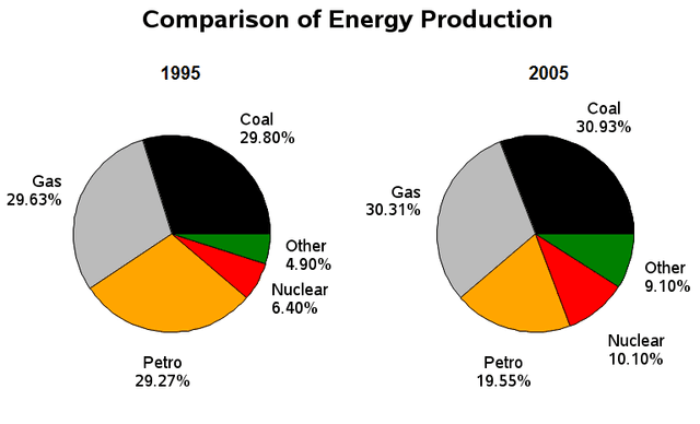
The supplied information depicts the amount of
energy
production in a certain nation in 1995 and 2005. Use synonyms
Overall
, the percentage of Coal accounted for the highest proportion of all figures in both pie graphs Linking Words
whereas
Nuclear occupied the lowest ratio apart from other Linking Words
energy
. The generation of almost all the given data except for Petro ascended for Use synonyms
provided
10 years.
Focusing on the details, the proportion of Coal generation increased by a third from 1995 to 2005 and Correct article usage
the provided
this
rate maintained the highest demand.
Linking Words
Similarly
, Gas Linking Words
also
kept its place and the production of Linking Words
this
Linking Words
energy
was approximately 10% lower than that of Coal which is 29.63% and 30.31% respectively. Use synonyms
Moreover
, Nuclear power gained popularity by about 4% over 10 years and Linking Words
this
gap is the same as other kinds of Linking Words
energy
which is about 4%.
It is interesting to note that the share of Petro crept down for the given timeframe. In 1995, Use synonyms
this
type of power was as popular as Coal but it decreased by half in 2005. Linking Words
However
, the accounting position did not change.Linking Words