
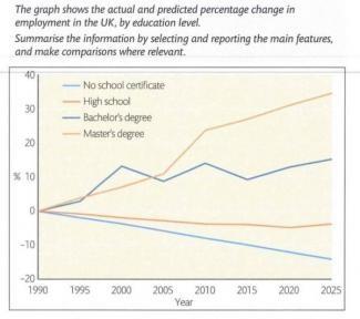
The lines indicate the real and future change in employment in the United Kingdom by education level.
This
writing will summarise, give several pieces of main features, and compare when necessary.
Linking Words
Overall
, there are four categories based on education degree that are highlighted in the chart from 1990 to 2025, some are increasing Linking Words
while
others are falling. The unit Linking Words
that is
used is in percentage.
To start with, in 1990 there was not any data for the graph, indicated by all lines intercepted at 0 value. Linking Words
Besides
, the need for workers possessing bachelor's and master's degrees is skyscraping, noting that postgraduate students are more highly requested than graduate ones.
Linking Words
Moreover
, there are two more education levels that have not been described, which are people with no certificate and undergraduates. As time went by, these two were constantly less needed for the workforce, defined by the falling slope from the beginning of the graph to the end, reaching about -2 and -15%, respectively.Linking Words