
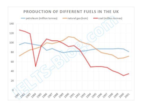
The line graph gives information about the production of coal, gas and petroleum in the UK from 1981 to 2001.
It is clear from the graph that there was a decline in the production of all three types of fuel over the given time period, especially coal.
To begin
, coal started out with the highest value of 127 Linking Words
million
Use synonyms
tonnes
produced in 1981, and Use synonyms
then
plummeted to 51 Linking Words
million
Use synonyms
tonnes
in 1984. Use synonyms
Thereafter
, the ratio recovered significantly to 106 Linking Words
million
Use synonyms
tonnes
in 1986. From Use synonyms
then
onwards, the ratio has been consistently declining and eventually reached a low of 35 Linking Words
million
Use synonyms
tonnes
in 2001.
The manufacturing of petroleum showed a slight increase from 96 to 100 Use synonyms
million
Use synonyms
tonnes
at the very start of the period. From 1983, there was a gradual decrease in production to a low of 79 Use synonyms
million
Use synonyms
tonnes
in 1989. Later on, from 1991 to 2001 the numbers remained relatively stable, between 80 to 87 Use synonyms
million
Use synonyms
tonnes
.
Natural gas manufacturing started at 72 bem and increased for almost 10 years, reaching a high of 113 bem in
1990. That point marked the start of the gradual decline of around 5 bem per year, to the low of 67 in 1999.
Use synonyms
Thereafter
, there was a slight recovery to 72 cm in 2001.Linking Words