The first chart below shows how energy is used in an average Australian household. The second chart shows the greenhouse gas emissions which result from this energy use. Summarize the information by selecting and reporting the main features, and make comparisons where relevant.

The first chart below shows how energy is used in an average Australian household. The second chart shows the greenhouse gas emissions which result from this energy use.

Summarize the information by selecting and reporting the main features, and make comparisons where relevant.
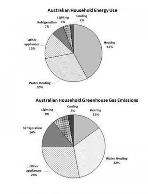
The given pie charts provide information about the average
energy
use and the
energy
use which causes greenhouse gas emissions in
the
Correct article usage
apply
show examples
Australian accommodations.
Overall
,
it is clear that
water heating was one of the highest percentages for both
energy
use and CO2 emission in the Australian household.
Firstly
, the most of
energy
used by Aussie families was heating 42 per cent, followed by water heating almost one-third of the chart.
Furthermore
, other appliances were 15%, so it became a third of the chart.The
last
three on the pie chart were refrigeration for nearly one-tenth, lighting for 4% ,and 2 percentage for cooling.
Moreover
, the main clauses of the CO2 released from the house in Australia were H2O heating for 32 per cent, and other appliances for over one-third. Followed by, the refrigeration and the lighting were 14 and 8%, in order.
Lastly
, 3 per cent was shown for cooling.
Submitted by nattafirm1 on

Unauthorized use and/or duplication of this material without express and written permission from this site’s author and/or owner is strictly prohibited. Excerpts and links may be used, provided that full and clear credit is given to Writing9 with appropriate and specific direction to the original content.

Conclusion: The conclusion is too long.
Basic structure: Change the fourth paragraph.
Vocabulary: Replace the words energy with synonyms.
Vocabulary: Rephrase the word "information" in your introduction.
Vocabulary: The word "charts" was used 3 times.
Vocabulary: The word "percentages" was used 2 times.
Vocabulary: Use several vocabularies to present the data in the fourth paragraph.
What to do next:
Look at other essays: