
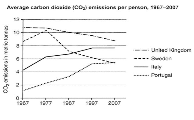
The graph depicts the average chemical compounds per person in four countries from 1967 to 2007.
Overall
, it is noticeable that the United Kingdom had the highest chemical emissions, Linking Words
while
Sweden and Portugal lowest. Linking Words
Moreover
, there is a significant uplift in Portugal and Italy , Linking Words
whereas
Sweden and the United Kingdom decreased.
Linking Words
To begin
with, the United Kingdom accounted for over 10 CO2 emissions , Linking Words
therefore
it declined gradually from 10 in 1977 to under 8 in the final years. The figure for Sweden improved from over 8 to approximately 10 in 1977 before levelling out to 5 in the final epoch.
In terms of Italy , it accounted for 4 which increased marginally to under 8 in 1997 before maintaining the same level between the next 5 aeon. Portugal had roughly 1 which rose progressively to under 4 in 1997 before going up to 5 in the final cycle. Linking Words
However
, Portugal obtained the lowest CO2 emissions over the period in question.Linking Words