
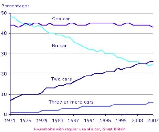
The line graph illustrates the percentage of British families with their regular use of a
car
between 1971 and 2007.
Use synonyms
Overall
, Linking Words
it is clear that
the number of households who have more than one Linking Words
car
had a significant increase over the period shown. In comparison, the proportion of people with no Use synonyms
car
dropped dramatically Use synonyms
while
the number of those with one Linking Words
car
remained steady over 46 years.
As can be seen, in 1971 there was a small minority who had three or more Use synonyms
cars
. Use synonyms
However
, in 2007 it began to increase gradually to nearly 6%. Linking Words
Likewise
, people who used two Linking Words
cars
were almost 8% in 1971 Use synonyms
then
they increased enormously to about 26% in 2007.
Linking Words
On the other hand
, there were around 49% of households with no Linking Words
car
in 1971. After that, they saw a sharp decline until they reached 25% in 2007. Use synonyms
Nevertheless
, the proportion of using Linking Words
cars
registered mild fluctuations in the first decades Use synonyms
then
it stayed constant. It is interesting to notice that, the number of families who had no Linking Words
car
and others who had two Use synonyms
cars
was the same in 2003.Use synonyms