
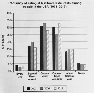
The bar graph illustrates the amount of time the US population consumes fast food from restaurants in percentages, over the period of 2003 to 2013.
Overall
, most people eat once a week Linking Words
while
less than 5% of people eat either never or every day.
Linking Words
Firstly
, the data remains consistent for the three time periods as there are no major differences between each other. In 2003, the leading choice of Americans to eat out was to order once a week
about 31%, followed by the highest percentage in 2006 for the same category at 33%, Linking Words
Linking Words
however
it dropped dramatically to under 30% in 2013.
Meanwhile, Add the comma(s)
however,
this
was no longer the most favoured option by 2013; the optimum choice for most people was to eat out once or twice a month as more than 30% of the population did so. Linking Words
Although
Linking Words
this
was preferred by 30% in 2003, it decreased rapidly to just 25% in 2006 but rapidly increased to the current data of 2013.Linking Words