
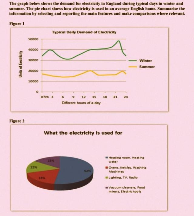
The line graph given illustrates how much electricity is consumed in the winter and summer by British people,
whereas
the pie chart represents how it is utilized by the residents of England.
Linking Words
Overall
, the line graph demonstrates the number of electricity Linking Words
units
used in a day during summer and winter, Use synonyms
while
the pie chart has categorized it into four proportions.
During the summer season, the Linking Words
units
consumed by England dwellers in the first hour are approximately 18,000, which decreases gradually to just above 10,000 Use synonyms
units
in the next nine Use synonyms
hours
, and they rise again up to 20,000 Use synonyms
units
between the peak Use synonyms
hours
. By the end of the day, the total consumption was 19,000 Use synonyms
units
. Use synonyms
Additionally
, in winter, 39,000 Linking Words
units
were used by the England people during the initial three Use synonyms
hours
and showed a significant decrease in the next three Use synonyms
hours
. The consumption constantly rose to 40,000 Use synonyms
units
when it was noontime. A whole day used about 34,000 Use synonyms
units
.
The pie chart enumerated the four categories, which have varied percentages. Number 1 has the largest consumption rate, which is 52.5%; the second portion has 17.5%; the third has 15%; and the Use synonyms
last
one has 15%.Linking Words