
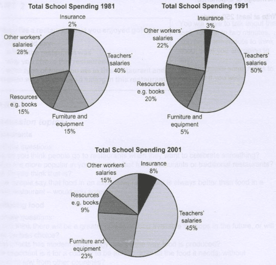
The three pie charts illustrate some information about yearly expense fluctuations in a particular British school in 1981,1991 and 2001.
Overall
, the teacher's salaries remained the biggest spending throughout the period. Linking Words
However
, the opposite was true for insurance.
To be more specific, in 1981, 28% of expenditure was accounted for other worker's salaries which Linking Words
was
Unnecessary verb
apply
then
slightly declined to reach Linking Words
bottom
highest point at 15% in 2001. Add an article
the bottom
Moreover
, insurance took 2% of Linking Words
payout
in the first 2 decades and Correct article usage
the payout
then
climbed up by 5% in the year 2001. The UK school expended exactly Linking Words
same
amount of money on resources and furniture and equipment at 15% in 1981 and later, the former rapidly went down by 10% and the latter rose by 5%. Teacher's salaries expense was 40%,50% and 45% making it the highest spending in 1981,1991 and 2001 respectively. 20% of spending in 1991 and 9% of expenditure in 2001 were accounted for resources.Correct article usage
the same