
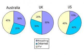
The pie chart reveals information about the number of youths between ages 13 and 19 and which were the preferred activities
such
as reading a book, watching TV or exploring the internet in their spare time for three specific countries in 2013.
Linking Words
Overall
, it can be seen thatLinking Words
,
the most popular leisure hour activity was watching TV in Remove the comma
apply
Australia
and the US in 2013, Use synonyms
while
in the Linking Words
UK
teenagers generally preferred reading when they were free.
Use synonyms
According to
the pie charts, the proportion of teenagers who spend their free time watching TV in Linking Words
Australia
and the US was the same, each at 45% of the total in 2013, Use synonyms
whereas
the relevant figure in the Linking Words
UK
was significantly lower, a fifth of the whole. When it comes to reading, the share of teenagers who were interested in Use synonyms
this
type of activity in Linking Words
Australia
was precisely two times higher than that in the US, at 30% of the juveniles, Use synonyms
while
in the Linking Words
UK
half of the responders devoted their free moment to reading.
Use synonyms
Finally
, using the Internet was represented by 40% of young people in the US in 2013, which made it a leader among the above-mentioned three countries. Linking Words
In addition
, the corresponding figures for the Linking Words
UK
and Use synonyms
Australia
were at 30% and at 25% respectively.Use synonyms