
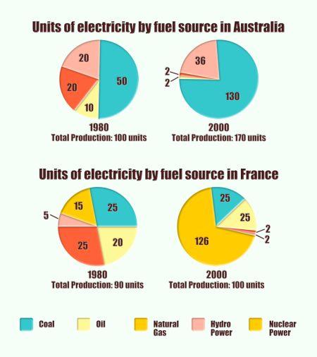
The given pie
charts
provide Use synonyms
types
of electricity used by fuel production in Correct article usage
the types
Australia
and Use synonyms
France
in the years 1980 and 2000.
As can be seen in the Use synonyms
charts
, there are five Use synonyms
units
of electricity production by fuel sources. Starting with coal, Use synonyms
oil
, natural Use synonyms
gas
, Use synonyms
hydro
, and nuclear powers, respectively.
Use synonyms
According to
the first Linking Words
charts
in Use synonyms
Australia
, the most popular fuel was coal in 1980, reaching 50 Use synonyms
as well as
in 2000, contributing 130. Linking Words
Whereas
the least popular one was Linking Words
oil
, it got 10. Use synonyms
However
, it decreased to 2, and natural Linking Words
gas
showed 2 by the year 2000. Use synonyms
Additionally
, the use of Linking Words
hydro
Use synonyms
power
Use synonyms
uplifted
by 16 in 20 Verb problem
increased
years
period from 20 to 36.
Now, turning to the second Fix the agreement mistake
year
Use synonyms
charts
in Fix the agreement mistake
chart
France
, there are small changes in proportions. Coal and natural Use synonyms
gas
varied the same 25, and to continue, Use synonyms
oil
was 20, nuclear Use synonyms
power
was 15, and Use synonyms
hydro
was 5. Use synonyms
Nevertheless
, in 2000 they saw dramatic changes which are the vast majority of nuclear Linking Words
power
, Use synonyms
it
reached Correct pronoun usage
apply
to
126. The same amount Change preposition
apply
were
coal and Change the verb form
was
oil
as well Use synonyms
natural
Correct word choice
as natural
gas
and Use synonyms
hydro
Use synonyms
power
. Use synonyms
By contrast
, the highest total production in 1980 was by Linking Words
Australia
with 100 Use synonyms
units
, whilst Use synonyms
France
was a little lower and it was 90 Use synonyms
units
. Even though in 2000 Use synonyms
Use synonyms
France
total was a little higher 180 Change noun form
France's
units
and Use synonyms
Australia
presented 170 Use synonyms
units
. In both countries, there was Use synonyms
10
unit change in two years.Correct article usage
a 10