
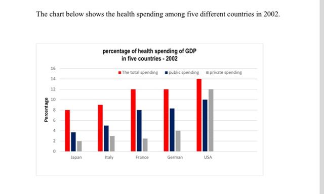
The graph illustrates the percentage of money spent on health care services in three European steady
countries
and two Use synonyms
non European
Add a hyphen
non-European
countries
over the year 2002.
Use synonyms
Overall
, the chart demonstrates that the total spending and public spending had simultaneously increased for all the Linking Words
countries
. Use synonyms
Linking Words
However
in private spending, it is shown to be low for all Add a comma
However,
countries
except for Use synonyms
USA
.
The graph Correct article usage
the USA
represents
total spending to be a gradual Verb problem
shows
increase
across all the Use synonyms
countries
from 8% to14%. There Use synonyms
seems
be a steady Add the particle
seems to
increase
of 2-4% in public spending as well, the highest being 14% and the lowest around 4.8%. Use synonyms
Furthermore
, private spending had an abrupt Linking Words
increase
for all Use synonyms
countries
- Japan, Italy, France, Use synonyms
German
, USA.
Replace the word
Germany
Lastly
, there is a trend Linking Words
oberved
between total spending and public spending. Starting withCorrect your spelling
observed
Correct article usage
a
increase
and Use synonyms
then
plateau , and Linking Words
then
starkly Linking Words
increase
a significant percentage. Use synonyms
The
similar trend is seen in public speaking as well.Correct article usage
A