
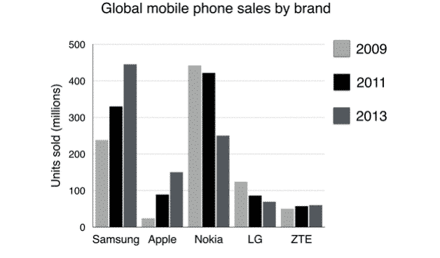
The Bar chart illustrates the international sales of electronic devices of the major five companies in different years.
Although
the X-axis depicts the brands, the Y-axis shows the sold quantity in millions.
Linking Words
Overall
, though there was a rise in demand for Samsung, Apple and ZTE from 2009 to 2011, the reverse is true in the case of others. Linking Words
However
, another interesting point is that the highest demand was for the two brands but in different years.
Linking Words
While
Linking Words
according to
the quantity, sales of Samsung almost doubled, considering the proportion, the number of mobiles sold by Apple soared from 20 to 150 million in 2013, which is around 7.5 times from 2009 to 2013. Linking Words
On the other hand
, considering both quantity and percentage, ZTE’s market share was low compared to any other brands.
Linking Words
Nonetheless
, in the case of Nokia, purchasing Linking Words
this
phone sank from 450 in 2009 to 250 in 2013, which is exactly the opposite of Samsung. After all, the rate of change of sales of LG was steady and small and it went down from 120 to 80 million from 2009 to 2013.Linking Words