
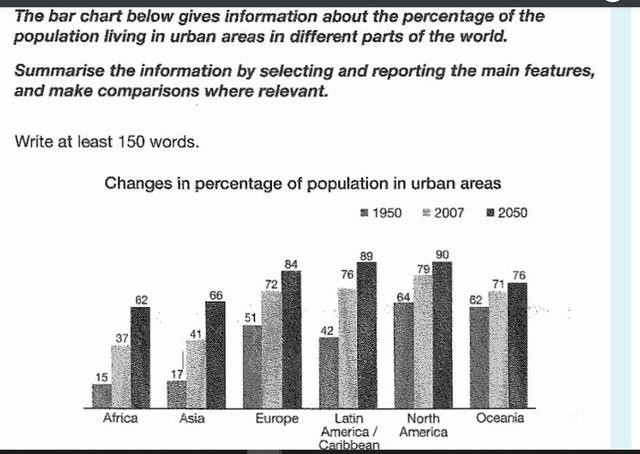
The graph illustrates information about the percentages of the
population
living in urban areas that differed between six continents (Africa, Europe, etc.) in the years 1950–2050. Use synonyms
Overall
, the changes in percentages of Linking Words
population
in urban areas have distinct rates from each other. It is crystal clear that the lowest rate of Use synonyms
population
in 1950 was observed in Africa, Use synonyms
whereas
the highest level of Linking Words
population
was seen in North America in the same year. Use synonyms
Similarly
, the highest and lowest levels belonged to the same continents in 2007. Taking a closer look at the bar graph, the percentage of the African Linking Words
population
in urban areas was only 15% in 1950 and doubled in 2007. Use synonyms
Moreover
, the Linking Words
population
is forecast to rise to 60% in 2050. Use synonyms
On the other hand
, in North America, the ratio was Linking Words
initially
four times higher than in Africa. Linking Words
Afterward
, it rose by 15% in 2007. It is assumed that it will reach a peak of 90% in 2050. When it comes to other continents, particularly Asia and Latin America, there was a substantial growth of the Change the spelling
Afterwards
population
, respectively, by 25% and 35% from 1950 to 2007. Use synonyms
However
, there was a slight upward trend of only 9 Linking Words
percent
in Oceania during the same years. Change the spelling
per cent
Besides
, the percentage of the Linking Words
population
will be moving upward until 2050.Use synonyms