
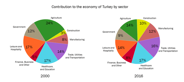
The pie charts compare the categories involved in the economy of Turkey in 2000 and 2016.
Overall
, it is evident that Linking Words
although
agriculture allocated almost a quarter of the contribution in 2000, it decreased significantly in 2016. Linking Words
In addition
, the diversity between groups was higher in 2000 and it became more similar ranging between 8 to 17% in 2016.
Linking Words
According to
the graph for the year 2000, agriculture, leisure, health care, and education were the greatest amount of contribution with 24%, 17%, and 17%, respectively. Linking Words
Additionally
, transportation and government expenditures took about a third of the costs. Eventually, construction and finance shared only 3 versus 5 per cent of money involvement.
Linking Words
On the other hand
, healthcare and education went to the first rank with 17% in 2016. Except for government and finance, all remaining categories were almost between 10 to 16%. Obviously, construction services with a 7% increase, reached 10%. Linking Words
Also
, agriculture experienced the highest fall with 10% in 2016.Linking Words