
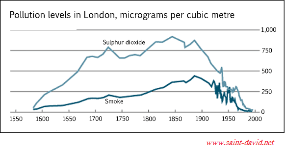
A glance at the graph provided reveals the amount of pollutants, specifically sulphur dioxide and smoke, in London from 1600 to 2000.
Overall
, both pollutants experienced similar patterns of ups and downs during Linking Words
this
period.
Beginning in the year 1600, sulphur dioxide found in the atmosphere was negligible. Linking Words
Then
the figure increased exponentially to just over 750 Linking Words
micrograms
in around the year 1720Use synonyms
,
and dropped to somewhere in the vicinity of 700 Remove the comma
apply
micrograms
in the 1800s. In comparison, smoke climbed steadily to just shy of 250 Use synonyms
micrograms
from 1600 to 1800.
In the Use synonyms
last
200 years, both pollutants followed the same trends. Sulphur dioxide topped at approximately 9000 Linking Words
micrograms
in around 1830, and Use synonyms
then
hit a trough at nearly zero Linking Words
micrograms
in 2000 with significant fluctuations in between. Use synonyms
Similarly
, the magnitude of the smoke reached a peak of nearly 450 Linking Words
micrograms
in 1880, exhibiting volatility between 1920 to 1960 before sliding away to almost zero Use synonyms
micrograms
in 2000.Use synonyms