
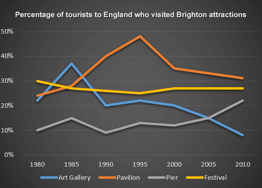
The line graph illustrates the percentage of visitors who visited four attractive places in Brighton, England between 1980-2010.
Overall
, both pavilion and art gallery popularity rose sharply at the beginning of the period, but it experienced a downward trend until the end of the period. The pier made up an upward trend Linking Words
while
the festival made a nearly constant amount of visitors with few fluctuations.
In 1980, the highest amount of tourists travelling to the festivals was around 30% ,and Linking Words
the
next 15 Change preposition
in the
years
gradually declined the rate to 25%. Use synonyms
However
, after 1995, festivals acquired more than 1% of people to their records and it remained constant until the end at about 26%.
In 1980, the pier was not popular and it selected around 10% of travelers. Next 5 Linking Words
years
it rose the amount to about 15% and had some fluctuations. Use synonyms
Furthermore
, after the year 2000 hit the peak point of its visitors around 22%.
The pavilion Linking Words
initially
had dramatically surged from about 22% to 48% within 15 Linking Words
years
as the most favourite place in the Brighton attractions. But, it plummeted to about 35% within the next 5 Use synonyms
years
, Use synonyms
also
Linking Words
then
experienced a downward trend to hit the lowest of about 30%. In the year 1995, the art gallery's travellers were about 22% and it rose significantly to around 38% in 2000. Linking Words
Then
presented dramatically declined to about 20%. Linking Words
Moreover
, until 2010 its popularity was gradually declined to 8% and recorded as the lowest popular place.Linking Words