
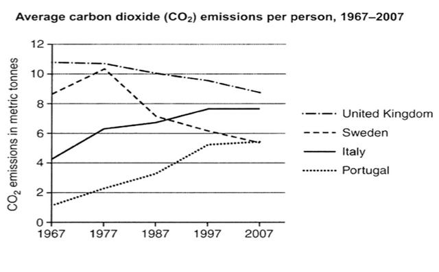
The given line graph portrays the average of CO2 emitted by individuals in the United Kingdom,
Sweden
, Italy and Portugal from 1967 to 2007.
Generally speaking, the United Kingdom was the country that produced the biggest amount of gases compared to the rest of the countries. Use synonyms
Furthermore
, both the United Kingdom and Linking Words
Sweden
decreased their carbon emission during the provided time period, Use synonyms
while
there was a rise Linking Words
of
emissions in Italy and Portugal.
In 1967, an English citizen produced above 10 Change preposition
in
tonnes
of gases on average. Use synonyms
This
steadily plummeted , reaching around 8.5 Linking Words
tonnes
in 2007. Meanwhile, carbon Use synonyms
emission
for individuals in Fix the agreement mistake
emissions
Sweden
were around 8.5 in 1967, reaching a peak at around 10.2 in 1977 and falling afterwards, getting an average below 6 Use synonyms
tonnes
in 2007.
Italy started the period Use synonyms
roughtly
at 4 Correct your spelling
roughly
tonnes
per person, Use synonyms
while
Portugal was slightly at 1.5 Linking Words
tonnes
. Both countries presented a climb of Use synonyms
carbons
emissions, making Italy surpass Change the noun form
carbon
Sweden
after 1987 and Portugal reach the same country in 2007. After 1997, both countries hovered around the same level, at an average of 7.8 and 5.7 for Italy and Portugal respectively.Use synonyms